CARE4U lowers the barriers of finding the best solution for your healthcare needs by streamlining the process using AI.
UI & UX
Product Design

Project Overview
Class: IDT 150 Digital Prototyping
Team: Anna Tran, Brianna Warren, Cindy Wan, Grace Mensing, Harish Bommakani
Timeline: 5 weeks (2023)
My Role: Lead UX/UI Researcher and Designer
Tools: Figma, FigJam, Adobe Illustrator, Google Docs, Sheets
The Brief
There are people who are in need of public services but do not know where or how to access them. Many people in need have cell phones and access to technology at libraries and other public facilities.
What can keep them aware of services, help them gather information, and enable them to make informed decisions about obtaining assistance? How will they understand how many service providers there are and what associated information is required to gain assistance?
The Design Approach
Discovery: Discuss potential ideas and decide on the best avenue to achieve our goal
Analyzing: Research and create a target persona to understand the user
Strategizing: Create workflows and information architecture to focus on key interactions
Ideating: Wireframe potential flows and layouts
Prototyping: Build a higher fidelity prototype by using a design system
Testing: Receive feedback from our professor, peers, and test users
Refining: Integrate critique into MVP

DISCOVERY
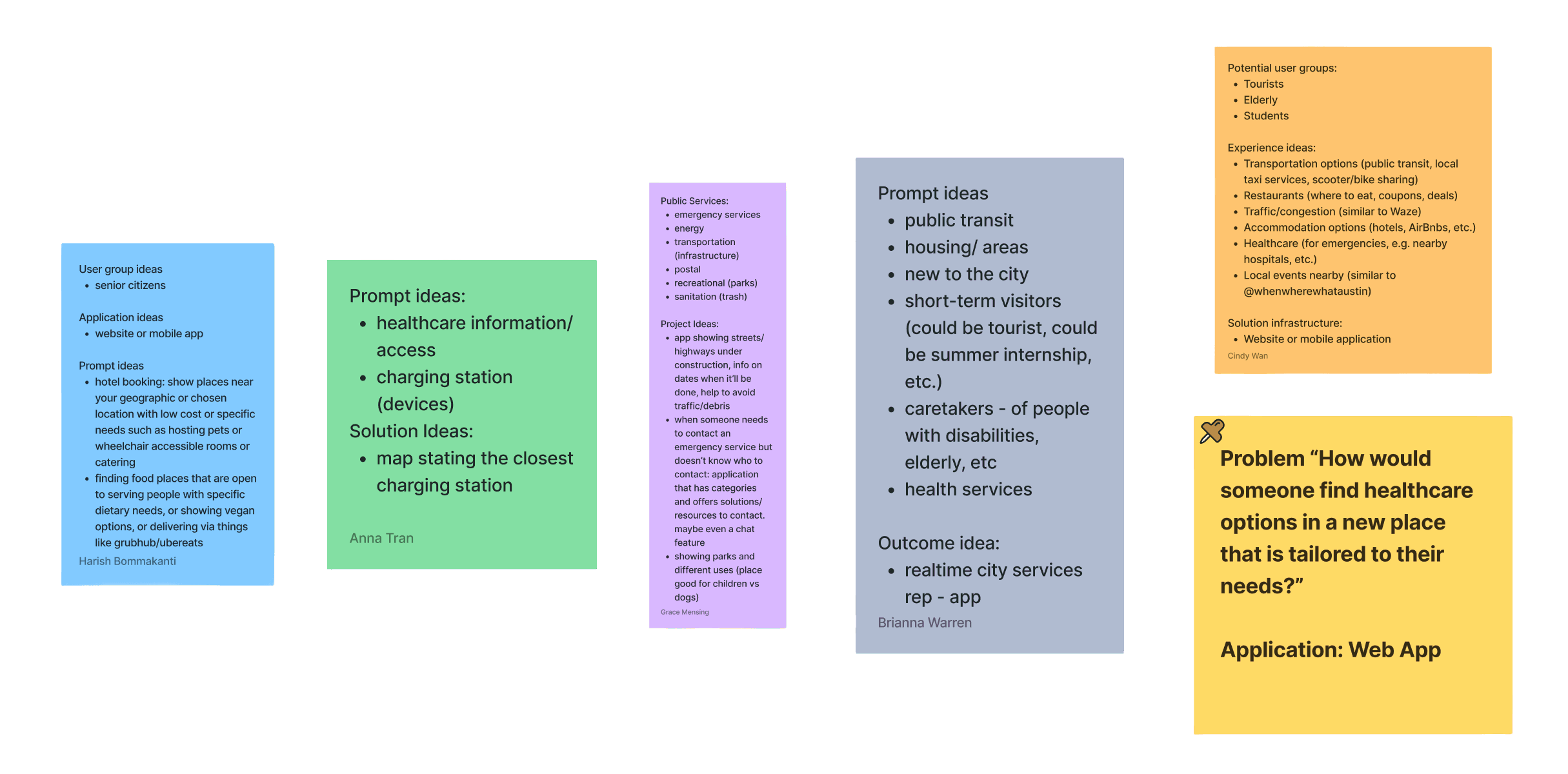
Brainstorming an Initial Idea
Discussing ideas as a group
Given the very broad topic, each person began by noting their initial ideas of what we could help with. We then looked at everyone’s answers as a group and identified lines where many of us saw a need.
We selected my idea: focusing on healthcare as a service, and on someone in a new area as a demographic type in need of service assistance.
ANALYZING
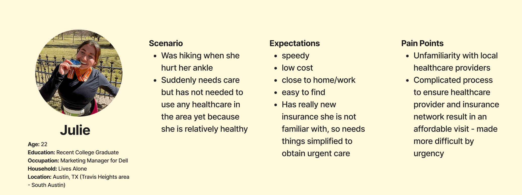
Meet our Persona: Julie
Creating a persona to establish empathy
We wanted to better understand our target user, so we built a persona for our research based on a demographic we could easily test.
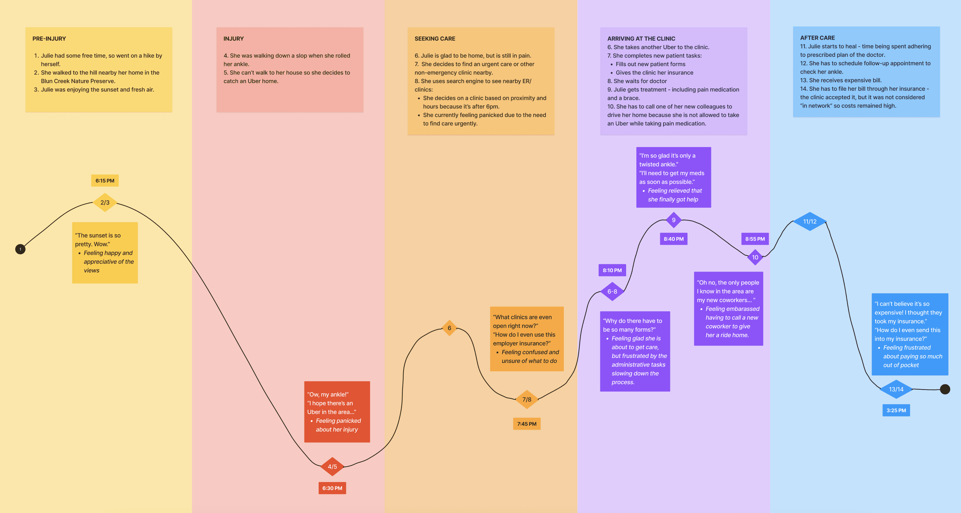
Julie's Painful Journey
Walking through Julie's experience of twisting her ankle
To understand the pain points of the healthcare system, we created a journey map that highlights the steps Julie takes after twisting her ankle and seeking help. We showed the level of emotion at each step, spotlighting where a web app could help make these lows easier for Julie.
STRATEGIZING
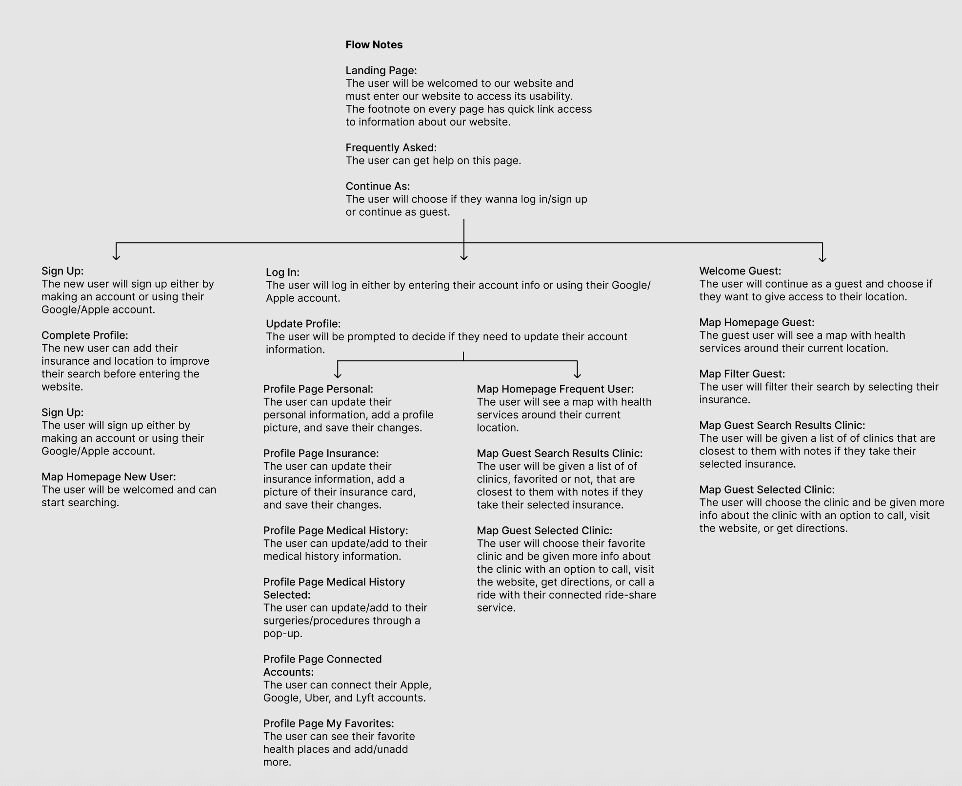
Workflow of Healthcare Website
Hierarchy focusing on the sequential flow
Our goal was to get our user healthcare that fits their needs as fast as possible. We included additional features, such as a login, represented by the red diamonds that indicate the required steps to reach certain pages. The profile information feeds in and out of the sequential flow, integrated apps, and networks to enable improved capabilities, as indicated by the dashed lines.

Information Architecture of Healthcare Website
How to seek urgent care and cursory-level insurance verification
We want to streamline the process for urgent care seekers. We made sure to include variants for registered users and guests because not everyone wants to share their info. This was added later, after discussion, and is reflected in both the sitemap and the workflow. This helped us find out where decisions need to be made and how we get from “I need care” to “I know where I am going and feel fairly confident it will work for my budget/location.” In the end, we want the option to integrate our service with other pre-existing apps or services to streamline care and decision-making even further.

IDEATING
Wireframing the Flow
How to use the website in different circumstances
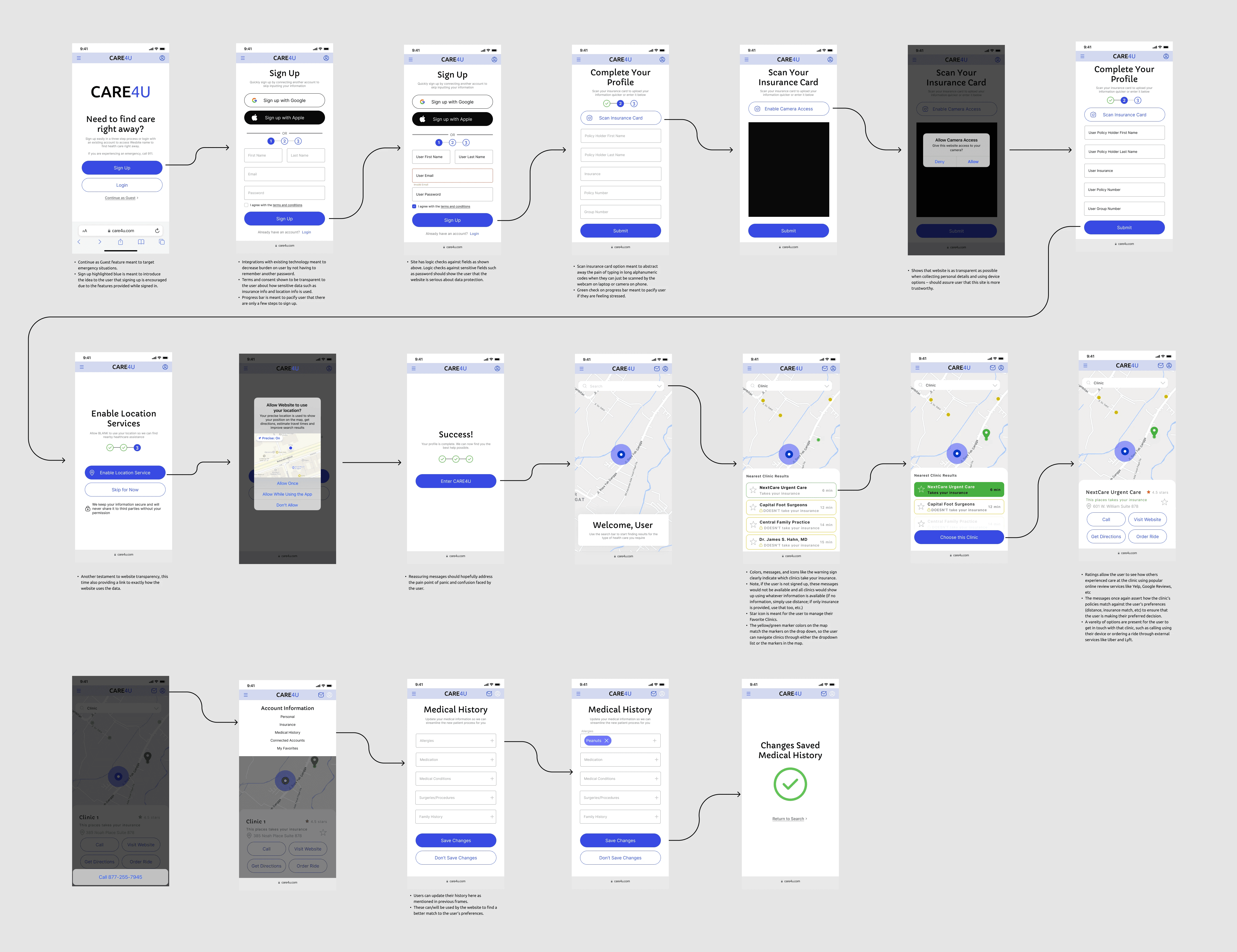
We split up as a team and each completed our own wireframes for how we envisioned our healthcare web app. I wanted to focus on the information the user gave and how they would interact with the web app to input that at different stages. If a user were signing up for the first time, their path would encounter minimal resistance to provide care as soon as possible. Existing users would easily log in to update their information if needed, as well as view their favorite places to receive care. Finally, a guest user would need to use filters to narrow their search, but they would still quickly find what they are looking for. I included signing up with an existing account and uploading a photo of a user's insurance card to streamline the process.
Walkthrough of the mobile wireframe
PROTOTYPING
Redesigning and Establishing the Golden Path
Using cool-toned colors to calm the unwell user
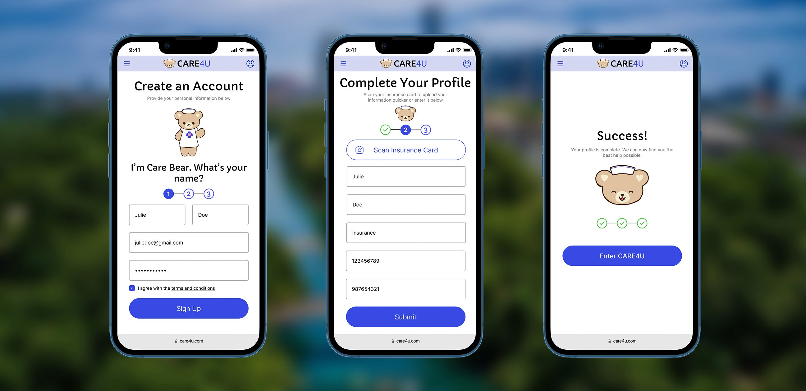
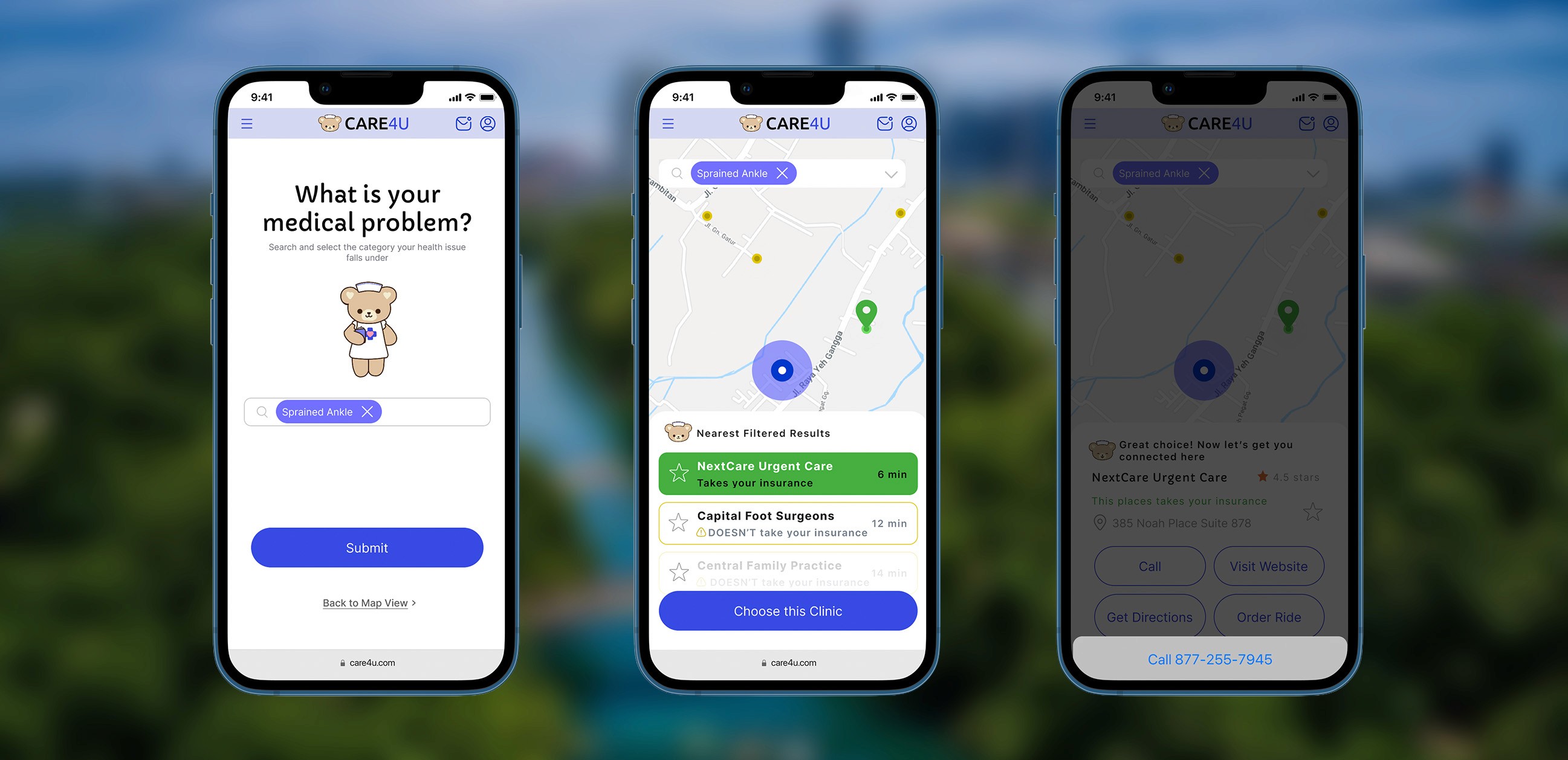
Our professor instructed us to use an existing design system to finalize our prototype. I found the design system called Orion and tweaked it to fit the mood we want to exude to users. I made the primary color a bright blue that is still calming but not boring or corporate. I redesigned the website, now called Care4U, to include more information and guidance at each step. Our team established a golden path for new users to follow when they signed up for the first time. I included the scan insurance card step during this process to make the process easier. Also, the steps help the user understand which part of the sign-up process they are currently on and how soon they can expect to access the web app's main feature of finding filtered care fast. I used more colors, such as green and yellow, to more clearly indicate which places accept a user's insurance and which do not.
High-Level Use Cases
Considering other personas
As a team, we wrote 10 high-level use cases for potential users and identified the needs that CARE4U should meet. We thought through the specific features of CARE4U and how they would apply. This helped us find users to test our web app and scope our prototype.
As a recent college graduate, I need my insurance information easily accessible in one place so I don't have to scramble to find it across multiple locations when I need care.
As a person who was recently injured, I need to find care quickly in order to get my injury addressed sooner rather than later.
As a busy young professional, I need to find clinics near me so I don't waste time traveling to a healthcare provider far away.
As someone seeking care immediately, I need to upload my information quickly to streamline the process.
As someone who just rolled my ankle, I need transit options available to me to travel to the destination for care.
As a busy young professional, I need to easily access my preferred providers in order to return to a healthcare provider I enjoyed in the past.
As a person seeking healthcare, I need to connect to my pre-existing accounts, such as Apple Health or Google, in order to reduce the number of passwords I need to remember when logging in.
As a recent college graduate, I need to easily see whether a clinic is in my insurance network to avoid wasting time filing insurance claims after my visit.
As a recent college graduate, I need to easily determine whether a clinic is in my insurance network to avoid costly healthcare visits that are outside my budget.
As a person seeking healthcare, I need to be able to send my information to the healthcare provider as quickly as possible to streamline the patient intake process.
REFINING
Final High-Fidelity Prototype
Using critiques, iterating, and testing with users
After showing our golden path in class, we received great feedback surrounding the tone of our web app. Our professor was not feeling as at ease as we intended. We decided to add a mascot, Care Bear, to help guide users through the whole web app with questions and directions. After this change, we took it to the field to test on potential users.
We tested how easy it was to use, how helpful it was during an emergency, how smooth the sign-up process was, and whether users would just "continue as guest" or sign up. We allotted 30 minutes per user and conducted the testing as an unmoderated remote walkthrough. We were there to provide help with minor confusions when needed and to ask guiding questions about hypotheses if they hadn't already been addressed. We wanted to see how a new user would approach a new web app. The test users we selected were our version of Julie: nearby in age, had used urgent care, were not terribly experienced with handling insurance, and had recently moved to a new place. Most people were close relations, i.e., siblings, coworkers, and close friends.
Based on the responses we received from user testing, users preferred to use “continue as a guest” rather than sign up. If they did want to sign up, they wanted to do it through Google or Apple instead of email. The sign-in process is smoother than other insurance sites that users deal with. Features like insurance card scanning are good, but half the testers prefer to type it in manually for a sense of security. Once in the map view, the button and search bar were confusing because they looked like a pop-up ad. The majority of the users selected “allow while using the feature” because people don’t want the company collecting data to see what they are doing elsewhere, and the “allow once” is annoying, having to give it permission every time. Personalization (teddy bear, RICE method page, search by problem) helps a lot and is a better alternative to sites such as WebMD. The color scheme is calming but also serious. It is not too relaxing, so the user focuses on finding help, but also does not feel too juvenile. Overall, users deemed it easy to use if someone is panicking about a medical problem.
With More Time and Resources
To further improve CARE4U, we would clear up minor features that seemed to confuse users, such as the text in buttons/description fields, ratings vs favorites, etc. We would include scanning the back page of the insurance card and putting a disclaimer on the insurance scan card for what exactly can be scanned. Once a place is selected, we will add details about hours of operation, appointments, wait times, and forward medical information. Also, adding trusted sources for at-home care in the meantime.
Lessons Learned
I enjoyed gaining the experience of working with a group of students who were learning UX/UI design for the first time. I taught them how to use Figma and the importance of user research and feedback. However, this set back the fidelity of our project with the time constraint, as I was the only person designing the prototype.
Play with the Prototype
Feel free to interact with the prototype in Figma. Click the button to open it in a new tab or wait for the prototype to load below.